Views
📌 NOTE: Depending on your role and permission level, some of the following features might not be available for your account.
n
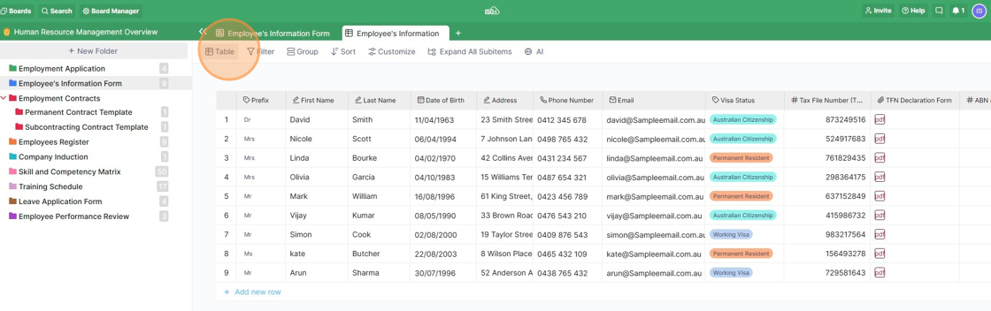
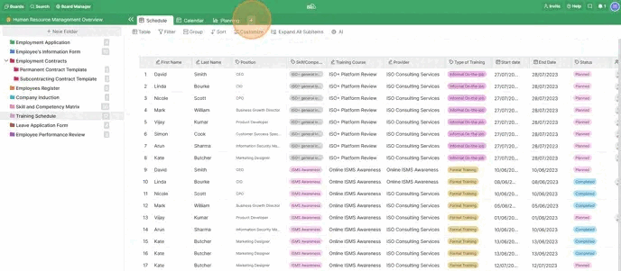
Table
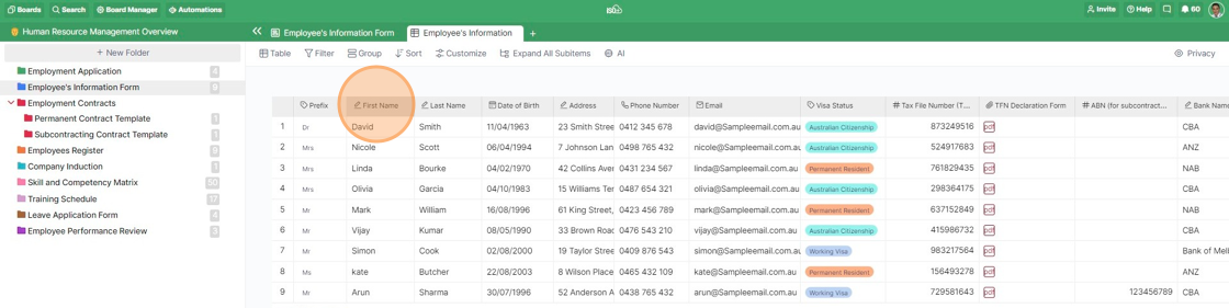
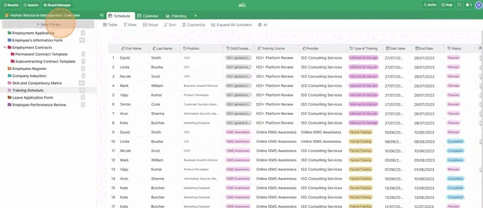
Whether you are used to working in Google Sheets or Excel files or decide to import a CSV file into one of your folders, the Table View might be the perfect choice.
A table presents a great solution if you have items with multiple attributes assigned to them because it offers a more condensed view that's easy to scan quickly. Through a table, you can see all those attributes at a glance.
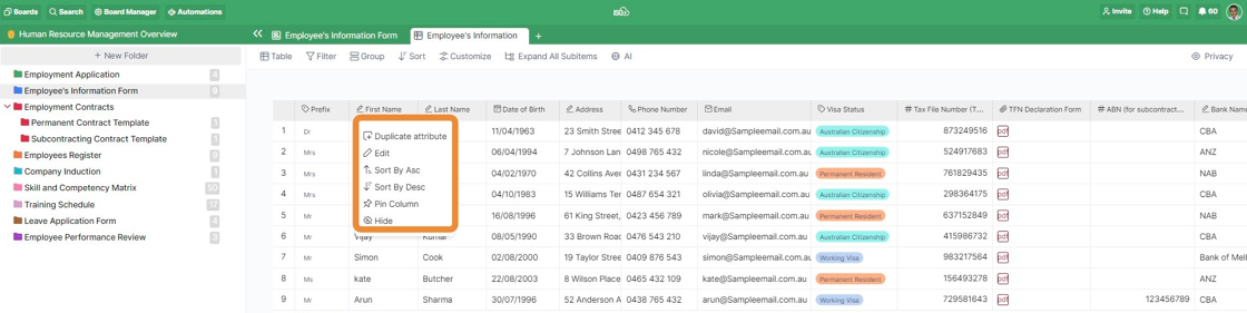
Depending on your role and permission level, when you click on the name of the column, you have more options to choose what you want to do. It can be duplicating the attribute (column), editing, sorting, pinning the column or hiding the column. It's possible to pin multiple columns in this view.
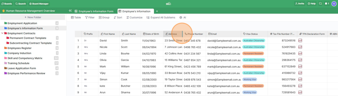
In case you want to resize columns in your table, hover over the line between two columns until the small arrow symbol appears. Resize the column to your liking.
Also, you can easily reorder your attributes by dragging and dropping them. Click on the column (attribute) you'd like to move and drag it to a different position.
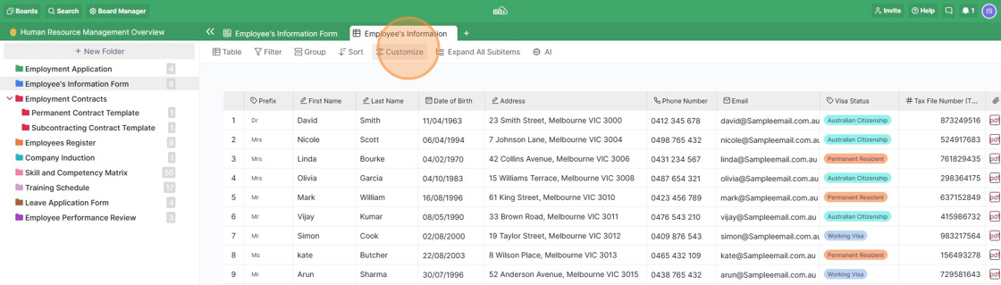
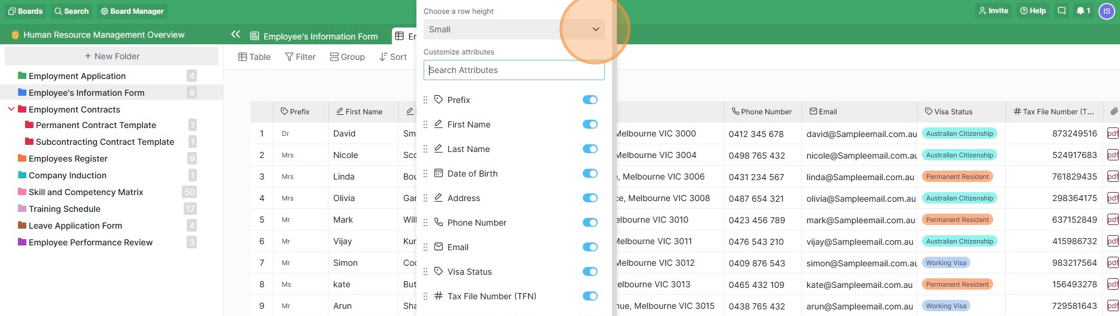
You can also decide on the table row height for all of your tables. To change the height, click on the 'Customize' option and then select one of the three available options: Small, Medium, or Large.
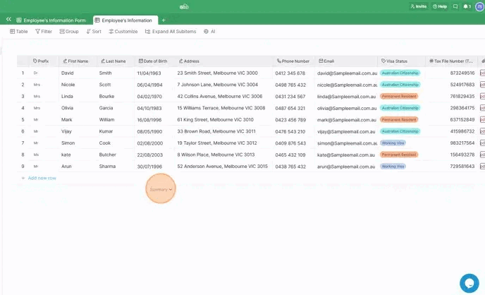
In the table view, you can use the Summary option. At the bottom of each column in a table, you’ll find a Summary option, which you can use to do some basic functions per column.
Hover over the space below each column until the Summary option appears, then click on it to choose the action you need to perform.
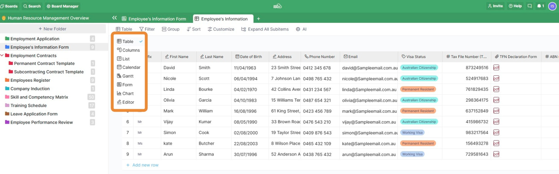
Columns
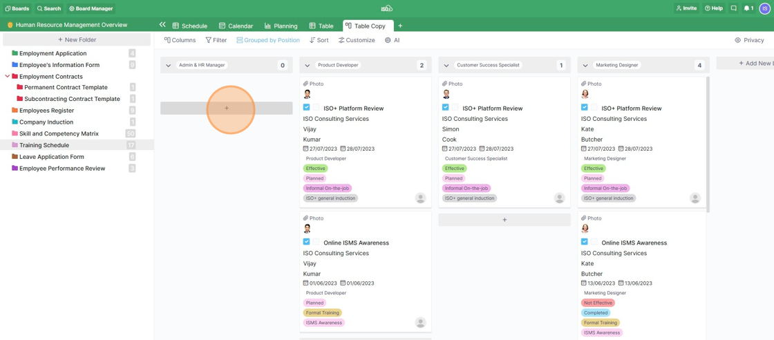
You can easily change what you want to group your columns by whenever you decide to. Simply click on the "Grouped By" button to change the attribute.
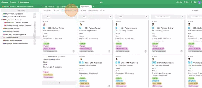
In ISO+™, moving items is as simple as drag-and-dropping them, but in the Columns view, this function can come in particularly handy.
It's also possible to drag and drop items within the same column and rearrange your tasks that way.
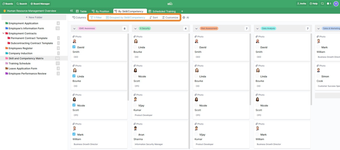
Just like in any other view, it's possible to customise your columns using the filter, sort and 'customize' options (in addition to grouping).
You can hide/show different attributes and make items in your columns look neater and better organised.
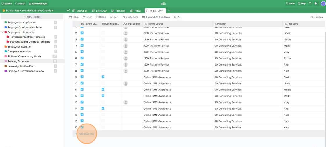
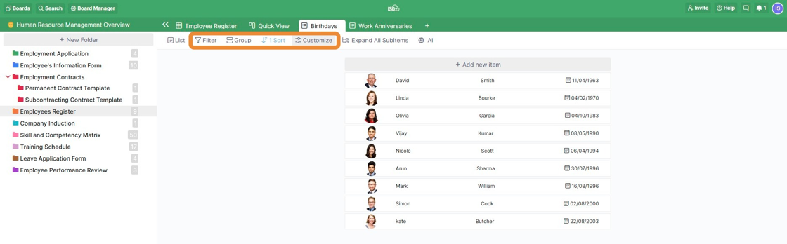
List
To add a new item to your list, all you need to do is click on the '+Add New Item' button. If you don't have any items on your list and are starting from scratch, then you'll only see this button on your screen. If you've already got some items on your list, then this item will be located at the top of the list.
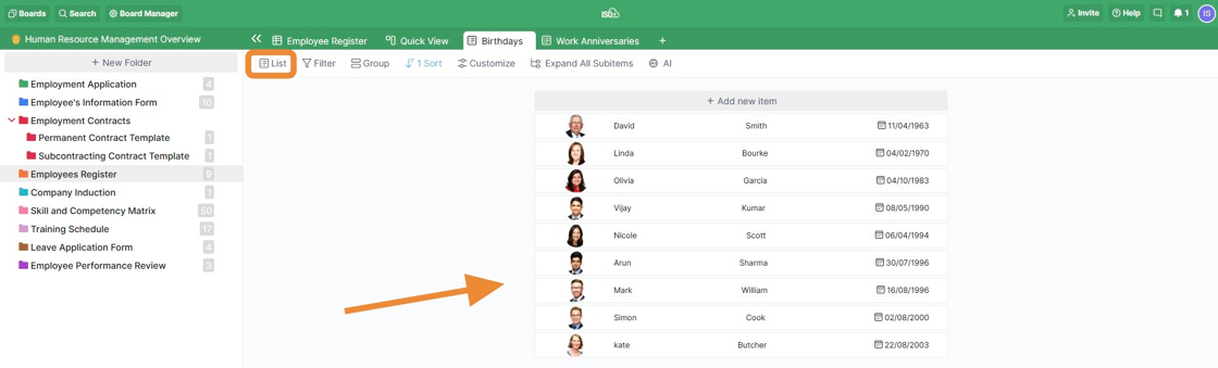
You can also group items in your list for a better overview of what everyone is doing.
And with the 'Customize' option, you can decide what you want to see on your list and what you don't want to see.
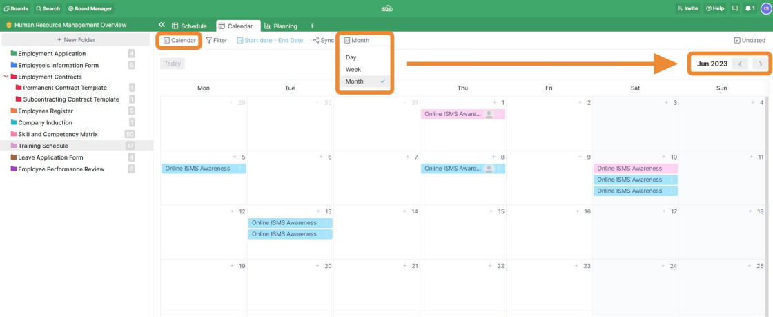
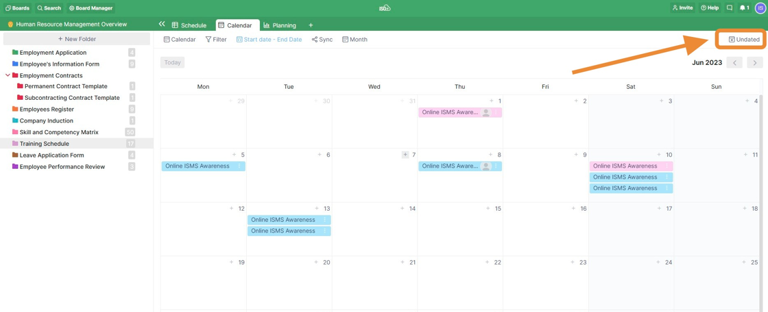
Calendar
For items that are time-sensitive, the Calendar view will be a great tool.
It will allow you to see all the important dates like deadlines, calls, meetings, events, etc. and easily manage everything you need to do.
In your calendar, you can get an overview of an entire month, week and even a single day. This means that you can also keep track of the exact time when something needs to happen and make detailed schedules. If you click on one of the arrows next to the name of the month (in this example) in the calendar, you’ll be able to go back and forth between different months. This is similar for the Week and Day periods.
Depending on the "Preferred Language" you set in your computer's browser, you will see different date formats. In the following example, English (Australia) is the preferred language.
To change or add your preferred language, you should go to the Settings section of your browser and then select Languages, then add your preferred language language and set the browser in that language. The displayed dates are updated after refreshing the browser.

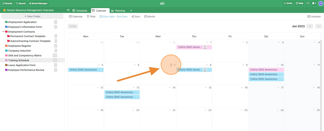
In order to add an item, just click on the plus sign inside the cell with the date that you need, give your new event a name, and then press Enter.
📌 NOTE: Instead of changing the date manually when, e.g. your meeting is delayed, you can simply drag and drop your items from one date field to another.
Above the Month, Week, and Day buttons, you will see a button called ‘Undated Items’. If you click on it, a sidebar will open to your right, where you’ll be able to see all the items that don’t have a date assigned to them. From this sidebar, you can easily drag and drop any undated items to the date field of your choice without having to go into every item separately and edit the date.
📌NOTE: You can synchronise the calendar view with your other calendars in one-way or two-way mode to display other scheduled tasks and public holidays in the ISO+™ Calendar. See Native Integration.
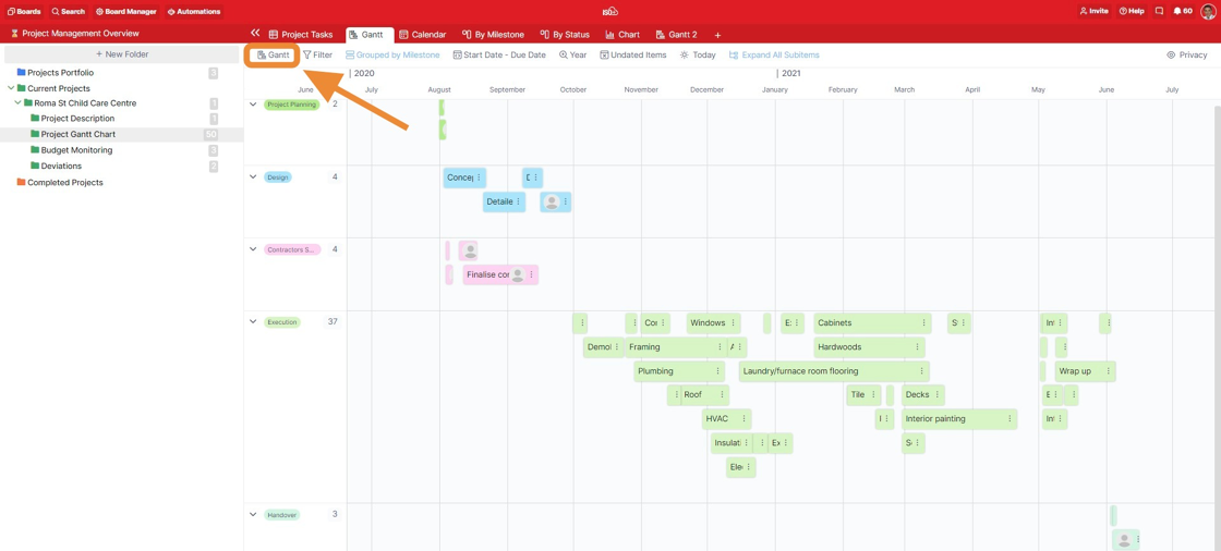
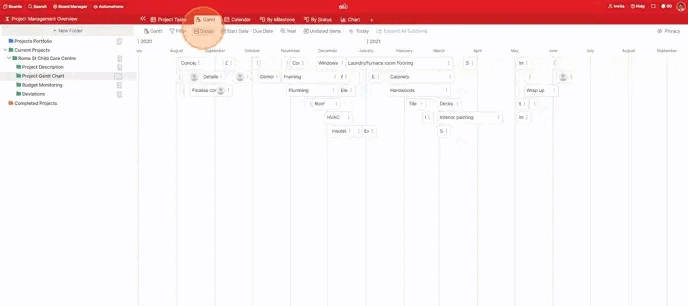
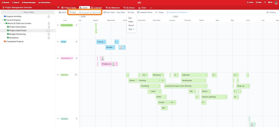
Gantt
The Gantt view will be useful to anyone who needs to visualise a timeline for their long-term projects and capture start and end dates in one simple view. It's a great solution for project planning, product roadmaps, growth experiments, event planning, and more since it shows you everything that needs to be done at a glance, when, and in what order.
If you're starting to create a Gantt from scratch, you will first be asked to set a date range. It is the same if you want to change the existing view to a Gantt view or create a Gantt view in a new tab.
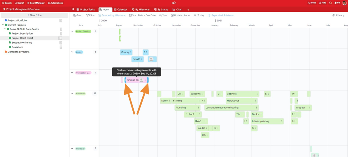
In the Gantt view, it's possible to easily change the date range of every item in your chart simply by dragging it from one of its ends. Hover over the item you want to change dates for until you see blue borders on both sides and an arrow symbol. Press and drag the end or the beginning of your item to the desired date.
In addition to this, you can also drag and drop your items to different date fields.
When creating items in your Gantt chart, all of them will be white and won't really stand out in this view. However, there's an easy way to change this.
If you have a label attribute in place in a different view on your board and have assigned it to your items, you can group them in your Gantt chart using this label.
Once grouped, your items will take the colour of the label assigned to them, and they will be neatly grouped by the names of the labels. You'll also be able to see the exact number of items that fall under a certain label.
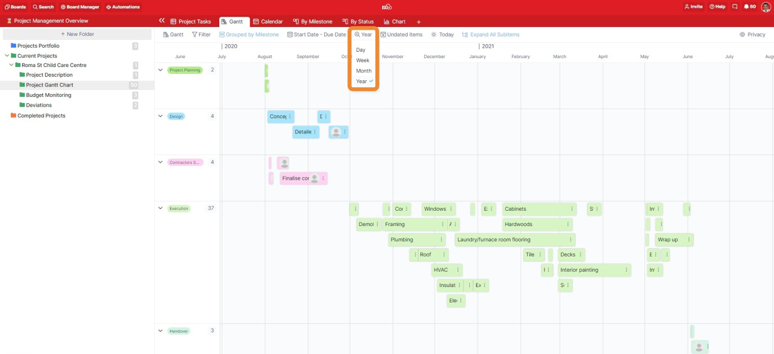
In the Gantt view, it’s possible to view your items and projects in a Year, Month, Week and Day view.
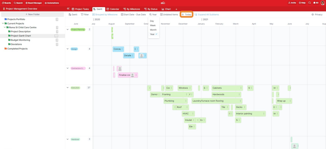
Also, by clicking on the 'Today' button, you'll be able to see all the items that have today's date as your start or end date.
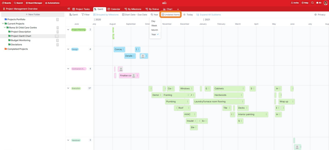
Similar to the Calendar view, by clicking on the Undated Items button, a sidebar will open to your right, where you’ll get to see all the items that don’t have start and end dates assigned to them. These are usually items that you created in another view, and that didn't require start/end dates at the time. If needed, you can drag and drop any undated items to a date field on your chart and then easily change their start and end dates.
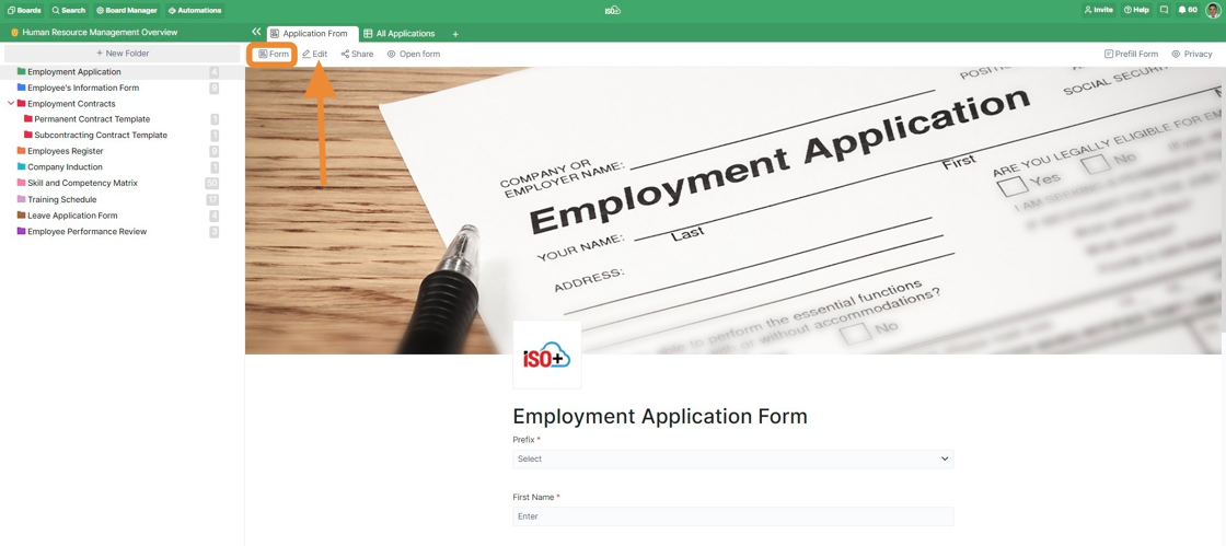
Form
The Form view allows you to create custom forms and share them with people outside your organisation, i.e. people who don’t have an ISO+™ account, but you can use that within your organisation as well.
With a form, you can collect feedback from clients or team members, gather the necessary contact information, and a lot more. It’s possible to share a form via a link and even embed it on your own website.
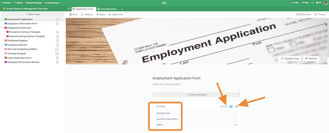
In the Form view, each attribute you add equals one field in your form.
The forms required for your workspace have been created by our team, but if you need any amendments, you can ask us to do that for you or edit them depending on your role and permission level.
You can edit the fields of the form by clicking the Edit button.
In Edit mode, the form title and form description can be added to/amended. The cover photo or the Logo can be removed/amended as well.
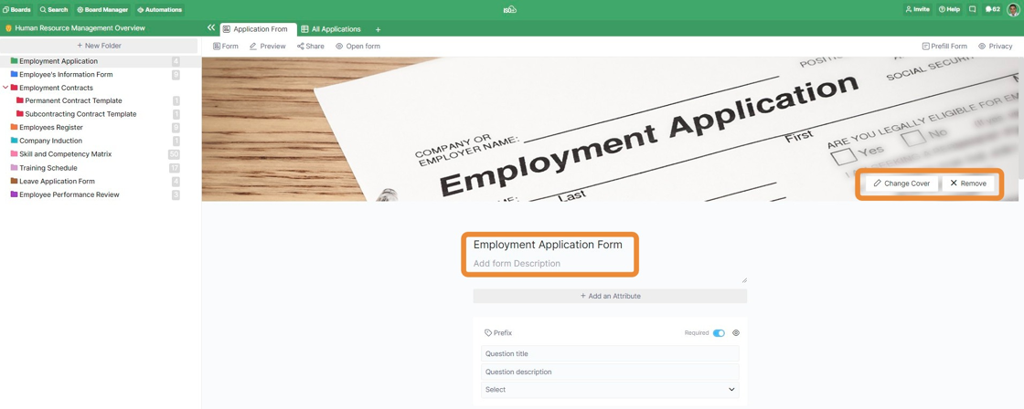
Every attribute field in the form can be included or excluded from your form by clicking on the small blue eye to the right of your field's name.
In the form, you'll also be able to choose which questions your users need to fill out, i.e. which answers you require for them. To the left of the small blue eye for excluding/including fields, you'll find the Required/Not Required toggle.
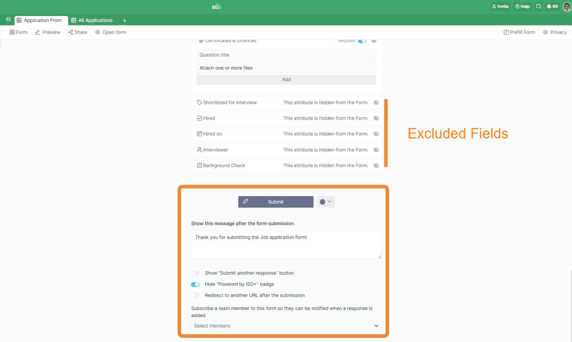
At the bottom of the form, you can see the fields that are excluded from the form. They are invisible to the users but still available and visible in other views.
In addition to this, you can also:
- Change the colour of the Submit button.
- Change the text of the Submit button.
- Write a 'thank you' message that appears after a form is submitted.
- Decide if you want to show/hide the "Submit another response" button.
- Decide if you want to show/hide the "Powered by ISO+™" badge.
- Choose if you want to redirect people to another URL after the submission.
- Subscribe a team member to the form so that they receive a notification every time someone submits a response.
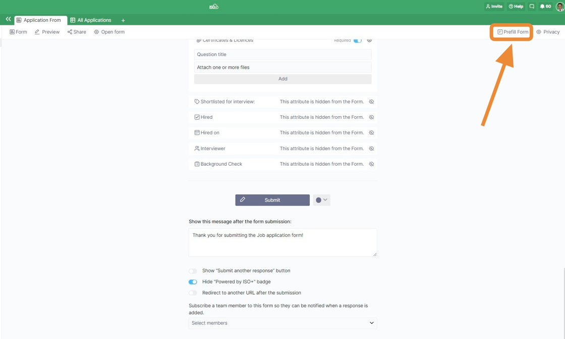
In the upper right corner of the form, there's also an option to pre-fill your entire form.
If you click on this button, a pop-up window will open up saying, "Enter the desired pre-filled data and press the button to generate a link that can be shared."
Once you fill out the data, you'll click on "Get link".
In the next window, you'll receive three types of links: shareable, in-app, and link for embedding.
Keep in mind in order to get the link, form sharing must be enabled.
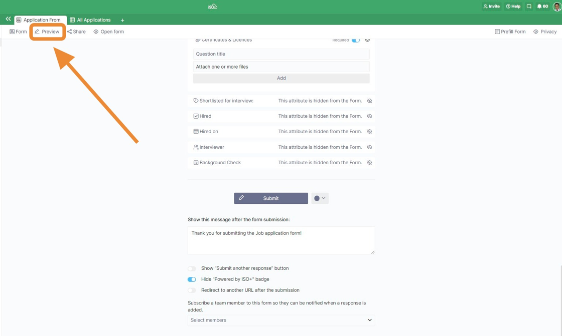
Before you go ahead and share your form with potential users, you can preview it and see if everything looks the way you want it to.
You'll find the Preview button right next to the view switcher below your tab. You can always switch back to the Edit mode by clicking the same button.
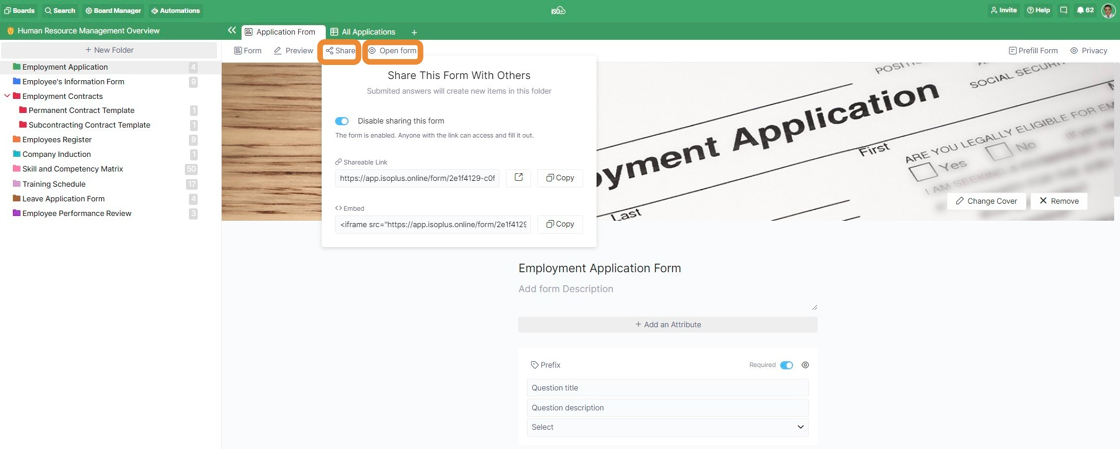
Once you're satisfied with how your form looks, click the Share button. Once you do, a small window will open. Here, you'll first need to enable sharing your form. Without doing so, people won't be able to see or access it.
Next, decide how you want to share your form: either via a public link or by embedding it on your website.
The 'Open Form' Button shows you the form in an online mode with the form shareable link.
As another feature to make sharing a digital form more convenient for users, a QR code can be generated and shared with them to be scanned and filled out. This feature is now available to the Admin users and through the ISO+™ Portal. To generate a QR code for a digital form, open the associated board and use the QR Generator Tile.

Then, select the relevant digital form from the Dropdown list and click the Generate QR Code button. Only the forms for which the sharing feature is enabled are displayed in the Dropdown list.
The "blank document" icon on the right side of the titles indicates a digital form, whereas the "complete document" icon indicates a document.
If you upload the company logo when you set up your ISO+™ Portal, it will appear in the middle of the QR Code image.

Whenever someone submits a response through your form, you will receive the information in the same folder where you created the form.
However, to see the information, you'll need to have another tab open, preferably with the Table view in place.
Every time someone submits a response, the information will appear in a new row as a new item.
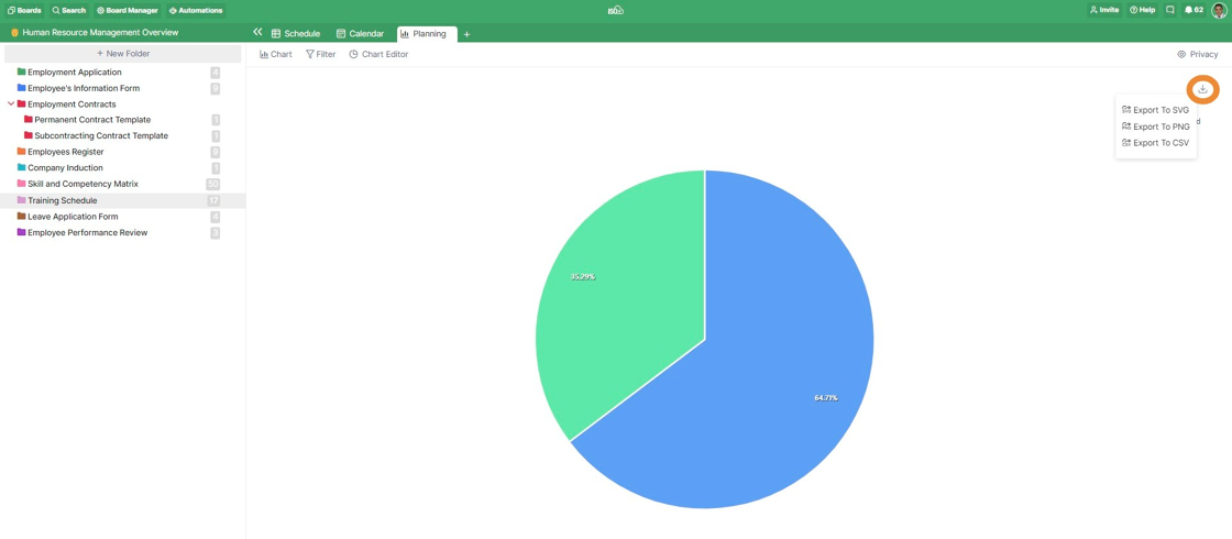
Chart
The Chart view will be a great solution for those who want to represent and analyse their data in a visual way.
With Charts, you will be able to create reports out of your data and display those reports through various types of charts.
In the central part of the chart view, you will be able to see your chart. In the top toolbar, as in all other views, you will see the Filter option.
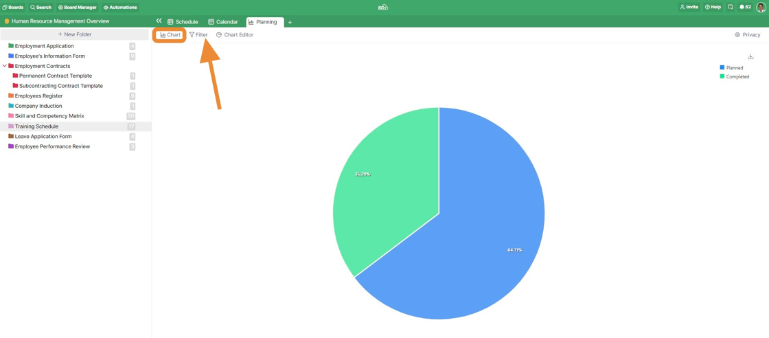
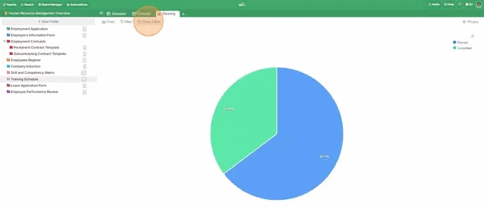
Right next to the Filter, you will see the Chart Editor. This button will serve to open and close the Chart Editor you can see on the right side.
In the Chart Editor,
- You can choose a chart type among 13 different chart types from 5 categories: Line, Columns, Bar, Pie and Area.
- You can choose which data type you would like to set as your X-Axis (horizontal). Here, you can also decide whether you want to sort your data and how.
- You can set the Y-Axis (Vertical) and choose which data type you would like to set as your Y-Axis, including attributes and item count. If you choose one of the attributes, you will also need to choose the calculation function. Here, you will also be able to set the line colour or add a trendline. For the Y-Axis, you will be able to add multiple data series.
- You can add and define one or more benchmark lines if needed. Once you click to add a benchmark, you will see the options to define its type, label, value and colour.
📌 NOTE: for both X and Y Axis, the attributes you can use as parameters will depend on the chart type you choose. Pie Chart will work a bit differently, and instead of X Axis and Y Axis, you will set the Label and Value.
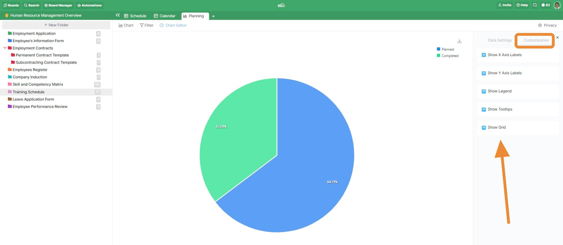
In the Customization part of the Chart Editor, you will be able to choose which elements you will be able to see in your chart and which will not. As a new feature, you can also choose if you want to show the Y axis for each series when multiple series are used.
You can export your chart as an SVG, PNG or CSV file by clicking the small arrow on the top right of your chart view.
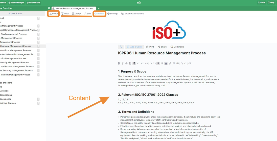
Document
The Document view will be a great solution for those who want to represent a document that is created as an item/subitem using a 'Long Text' attribute in your folder/subfolder.
The view is used within ISO+™ in the library board and includes all the documentation required by the standard/framework against which you want to certify or register your business.

📌 NOTE: Be mindful when sharing the link with others, as anyone with access to the link can view your documents. While hyperlinks to external sources or publicly available digital forms will function for that recipient, links to internal resources within the ISO+™ platform will not be accessible to them.
As another feature to make sharing a document more convenient for users, a QR code can be generated and shared with them for scanning and review. This feature is now available to the Admin users and through the ISO+™ Portal. To generate a QR code for a digital form, open the associated board and use the QR Generator Tile.

Then, select the relevant document from the Dropdown list and click the Generate QR Code button. Only the documents for which the sharing feature is enabled are displayed in the Dropdown list.
The "complete document" icon on the right side of the titles indicates a document, whereas the "blank document" icon indicates a form.
If you upload the company logo when you set up your ISO+™ Portal, it will appear in the middle of the QR Code image.

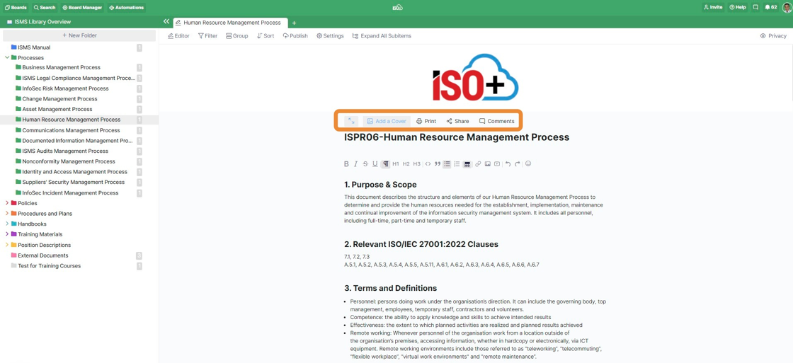
If your folder/subfolder consists of subitems, you can use the 'Expand all Subitems' option to see the subitems as well.
You can switch between the full screen and item list screen seamlessly, whenever you want, by clicking on the small arrows in the upper left corner of the document. You can add an item/subitem directly in the item list mode.
For each item,
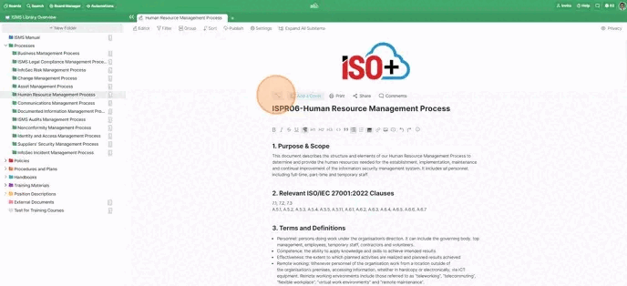
- You can add or change the Cover of the document
- You can print that document as a PDF file,
- You can share the link with others
- You can add comments and see the Activity Log of the document in the Comments section
Files
If you regularly work with images, videos, or other types of visual content, the Files view is designed to streamline your workflow.
With this layout, you can easily upload, browse, and organise files in a grid-based format, which is ideal for quickly scanning and locating the content you need. Each item includes a preview, giving you an instant visual reference that makes handling large file collections effortless.
In an existing tab, click the View Switcher and select Files. All files within the folder will appear in the new layout.

📌 NOTE: Only image and PDF files display a preview.
Files view includes all the flexible organisation tools found in other views. You can click the Filter button, choose an attribute (e.g., file type, date), and set your desired rules. Filtering works the same way as in other views.
You can also click Group and choose from the following options:
- None: Displays all files in a single grid.
- Item: Groups files by the item they belong to (e.g., files grouped by employee name).
- Attribute: Groups files by specific ‘Attachment’ attributes you’ve created.
- Item/Attribute: Groups by both item and attachment attribute.
- Type: Groups files by the file extension (e.g., PDF, JPG, PNG).
You can also sort files by creation date, last updated date, file name, file type, and file size.
You can click the Share button to reveal two sharing options:
In the first option, you can generate a public link to share the entire Files view. Recipients can browse, sort and download files.

Tick the boxes next to the files you want to share
Click the Share icon in the toolbar
In the pop-up, choose an expiry date (1 day to 1 year, adjustable later)
Click Copy Link or send the link via email directly


Dashboard
This view is a multi-panel layout that displays a view from your folder in each panel. All panels show the same folder items, so changes you make in one panel (like updating a status in a Table view) are reflected everywhere.
- Open the folder where you want the dashboard.
- Click the Add Tab button (the plus sign) if you already have some tabs in place, or click on the View Switcher.
- Select Dashboard from the list.

- Click on Add Panel to add a new panel to the view. It can be other views, described above in this article or the "Numbers" panel.
- Or copy an existing view from the folder (recommended if you already have filtering, grouping, or sorting set up). The panel will load that view with the same setup.

For each panel, all relevant settings is available as applicable, including renaming, resizing, rearranging, duplicating, removing, filtering, etc.

Below is an example of a dashboard view of an incident management system.

Timesheet
The Timesheet view provides a structured and transparent way to record, review, and analyse time logged by users across tasks, dates, and team members. This view is linked with the Time Tracking Attribute and designed to support operational tracking, payroll review, compliance evidence, and internal accountability, all in one place.
This view consolidates time entries into an organised layout, allowing you to group, filter, and summarise logged hours without switching between multiple tabs or reports.
Key capabilities of the Timesheet view
- Displays time entries by Date, Member (staff), and Item (Task)
- Shows start time, end time, and total duration for each entry
- Automatically calculates daily and period totals
- Supports multi-user visibility, approvals, and audit traceability
- Reflects real-time updates when time entries are edited or approved
Any changes made to time entries (such as edits, approvals, or deletions) are immediately reflected across totals and summaries in the Timesheet view.

Timesheet Settings
The Settings panel allows you to customise how time entries are displayed and analysed.
You can configure:
- Group By: Choose how entries are organised. It includes None, Date, Member, Item, or a combination of them.
- Logged By: Filter entries by a specific user or view all team members’ time logs.
- Date Range: View time entries for a selected period, such as: Everything, Today, This Week, This Month, or a Date Range
Today
